First things first, our Kitchen by no means needed a remodel. It was fully functioning and it served our family well during the first year here at the Ranch. We just felt that the heart of the home should feel more like us and loved the idea of rearranging the layout to achieve the flow and look we were going for.
There are still a couple things we would like to do (over time). But we are so happy with how the remodel came out! It was the first time we have ever used a contractor. We did the flooring ourselves as well as the design, but it was nice to have help on this one.
Like the true blogger that I am (insert sarcasm here) I forgot to take “before” photos.
So naturally, I snipped them from the listing images that you’ll see throughout this post.
BEFORE
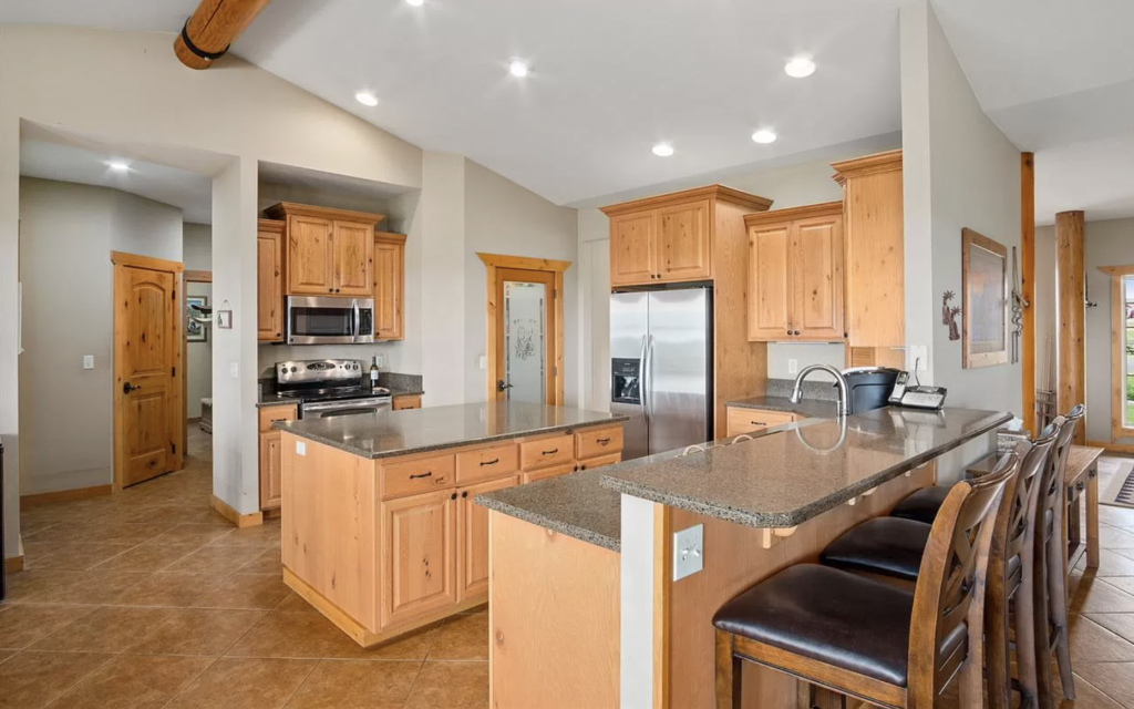
The kitchen is quite literally in the center of our home. We have a true 1-story Ranch style house and the front door leads you straight down the middle. I didn’t necessarily love the previous “flow” of the kitchen. Some simple updates would have still made an impact aesthetically, but we were really looking to utilize the space in the best way possible. To avoid massive construction, we simply changed the layout from a square shape, to a rectangular shape to elongate the kitchen into the living room giving it a more open feeling.
We did utilize the same footprint of the before kitchen. There was only one wall that we slimmed back (non-load bearing) which allowed us to completely remove the peninsula portion of the kitchen that previous had the sink.
TODAY

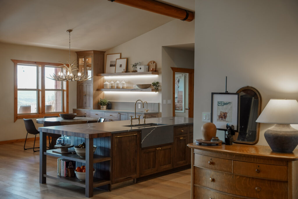

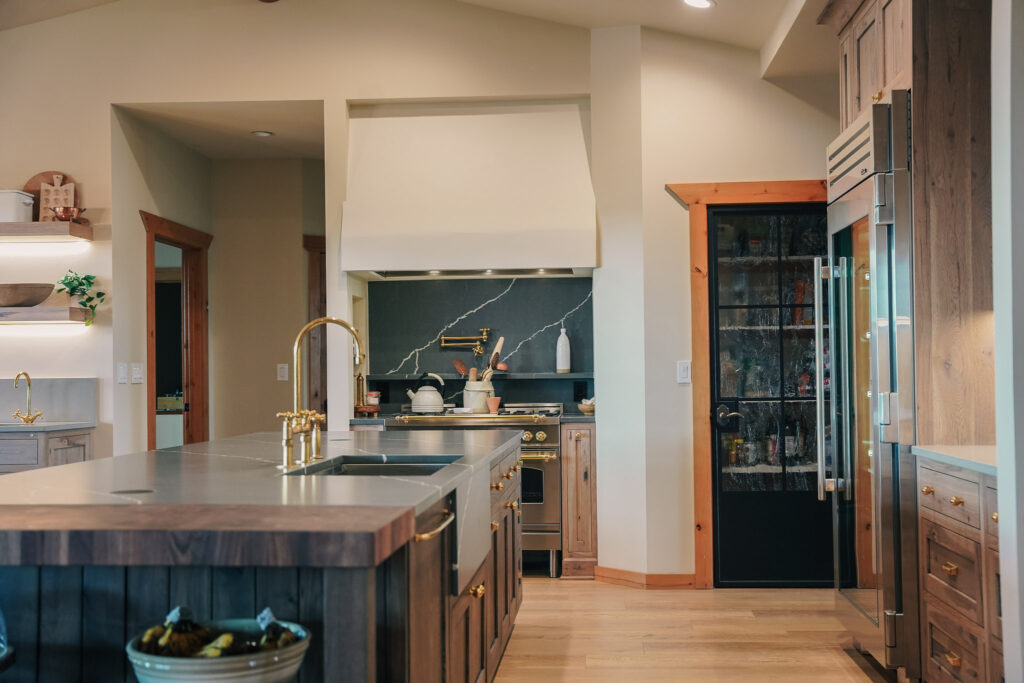
I love the open concept feeling that simply rearranging this kitchen presented. It allows me to be in the kitchen cooking, the kids can be doing homework at the table or watching a movie and no one feels left out. The kitchen is also right next to the dining room. So if we are ever entertaining, I wanted a big island that everyone could gather around with lots of food options down the center but didn’t want to clog the walk-ways with chairs. So we did not go for a “bar style” seating option in the island.
With the island being so long, the slab of quartz would have needed a seam. There is absolutely nothing wrong with having a seam (we have one in the dining room slab). But for the island to remain clean and crisp, we decided to have a butcher block at the end for contrast and to allow one full seamless slab.
BEFORE
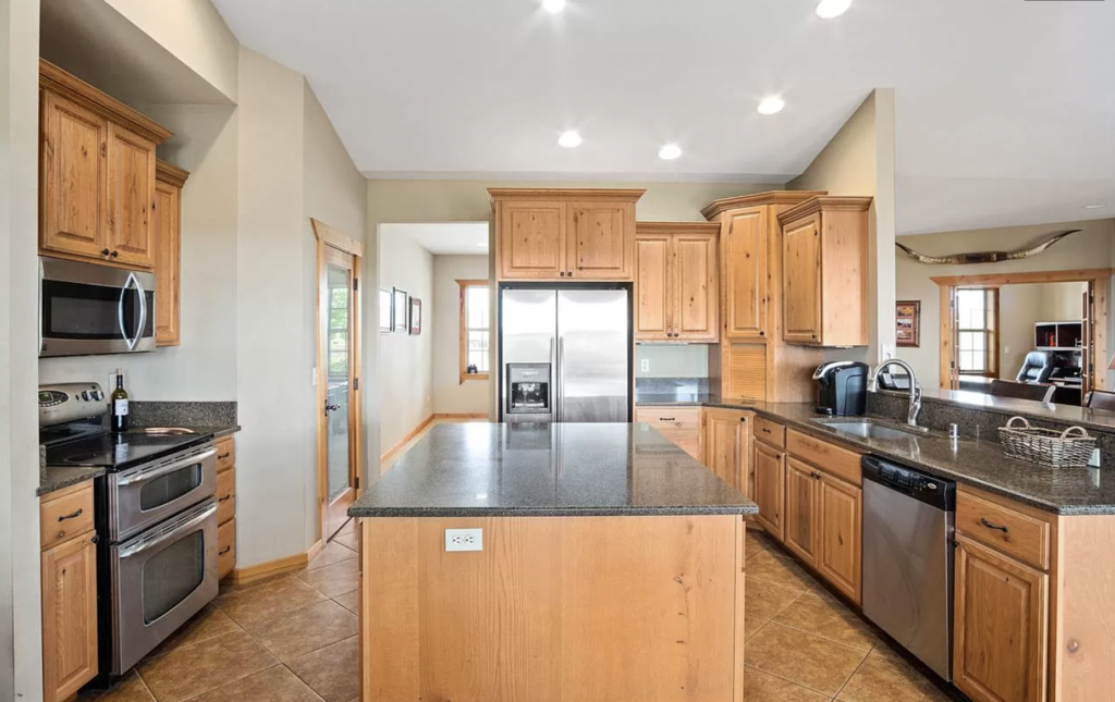
In this image, you can see how tight the space was. Lots of traffic when the hustle and bustle really picked up. The corner cabinet (to the right of the fridge) is where we cut the wall back to which eliminated the area where the previous sink and dishwasher were. By simply just redirecting the flow of the kitchen longways, it really opened up the room.
Also, by keeping the same footprint but rearranged, we didn’t really need to move water or power. It mostly all remained the same. But we do have a crawl space under our house which made things a little easier to move some things around.
TODAY
BEFORE
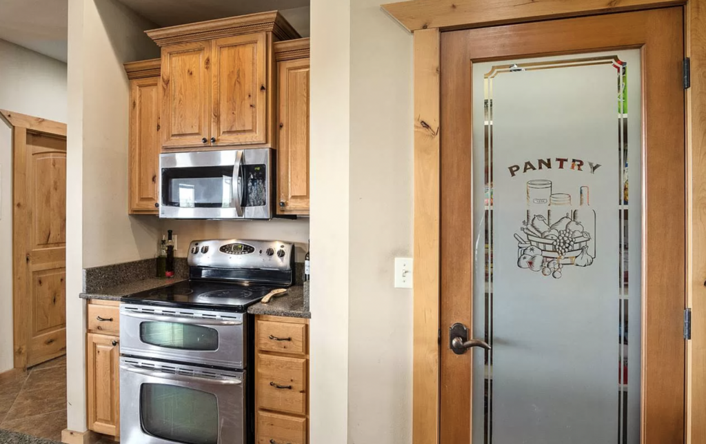
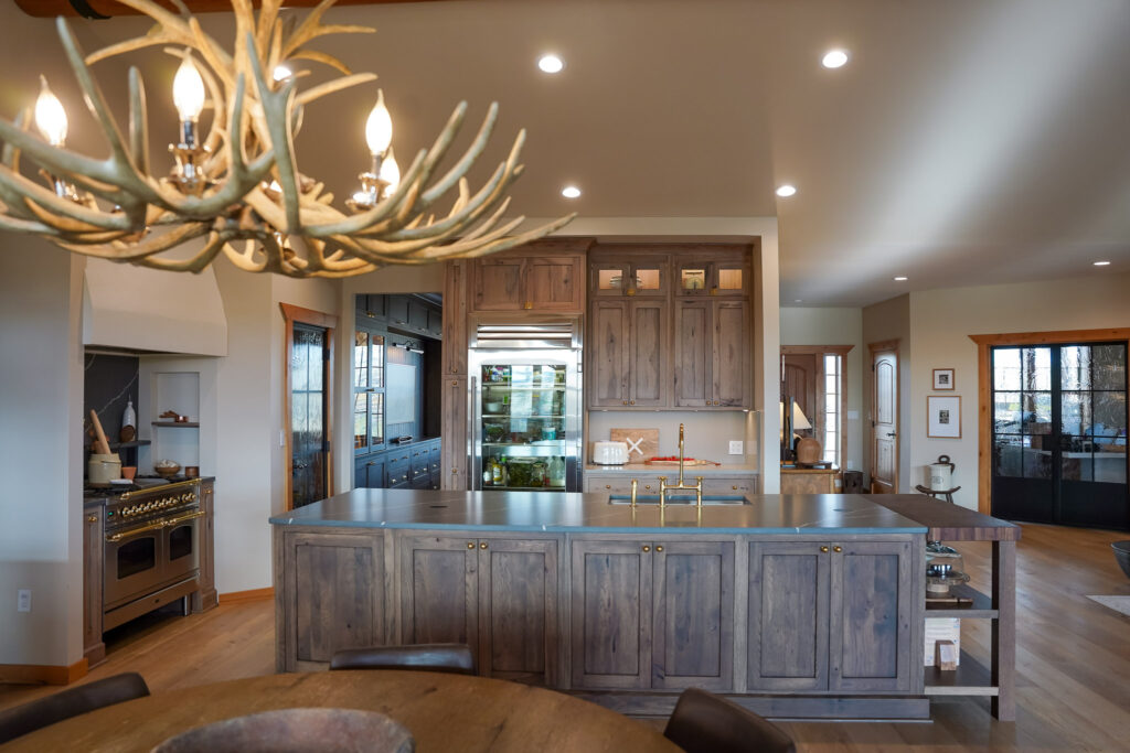
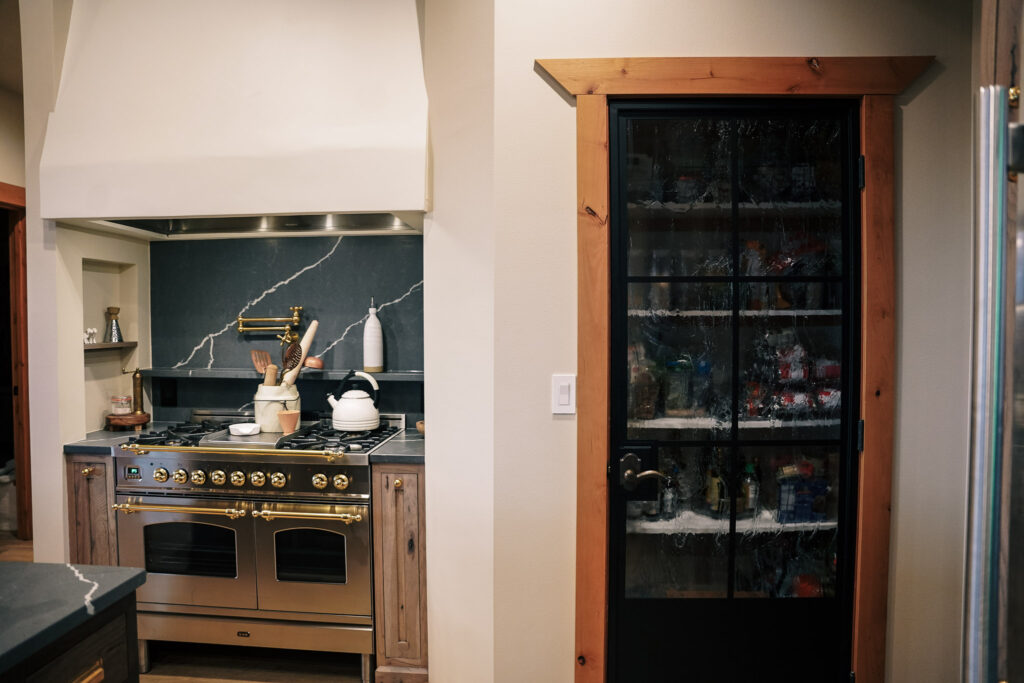
The microwave above the oven was removed and a custom hood was framed and installed with venetian plaster overlay. We bulked up the hood vent liner (we did need an HVAC person to come out and do this part) and we added in a larger oven. Believe it or not, this is the exact same amount of space. We couldn’t make it any bigger due to the pantry to the right. The pull out drawers next to the oven were made smaller to fit the larger oven and we opened up the dry wall alongside the countertops to allow for a little bit of extra storage options.
TODAY

BEFORE
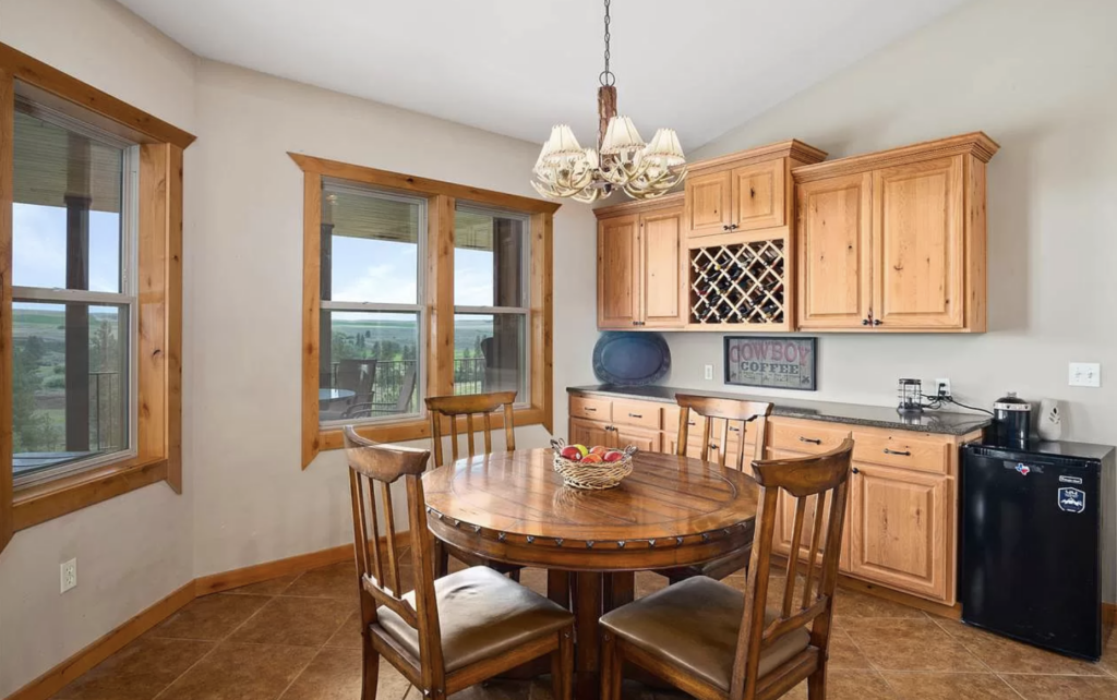
This area was always a pain-point visually to me. The storage was awkward and the gap that remained after removing the mini fridge between the cabinets and the walk-way was so hard to fill with generic “decor”. It wasn’t appealing to my eye and drove me crazy.
I wanted to add another sink for hand washing, food prep, you name it. By elongating the cabinets to the end of the wall, we were able to add a sink and not lose storage options. We have a pebble ice machine to the left of the sink and a coffee station in the cabinet on the far left.
This section became more of a “wet bar” area. I love the way it makes the kitchen feel more tied together.
TODAY
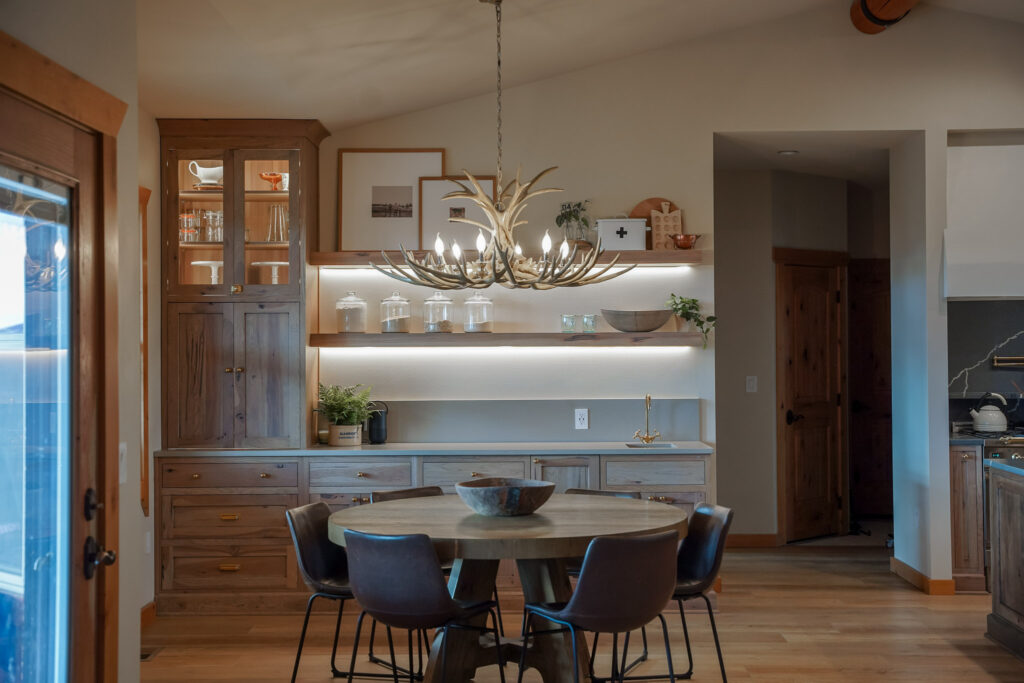


Although this kitchen remodel nearly took the entire year of 2022 and there were so many delays and back-ordered items, we are so happy with how it turned out and the decision to open up the heart of the home to meet our family needs.
If you are looking for any links to the items we purchased for our kitchen, head over to this blog post!



Comments +