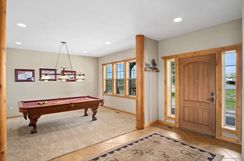
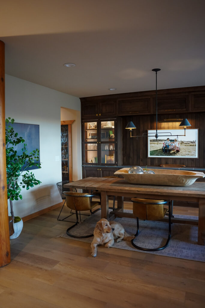
When we first moved in, this room was completely empty. The previous owners did take their pool table and light with them when they moved, so we were quite literally left with a perfect blank slate to turn this room into what suited us best.
Dining rooms are so old school (I know, I know). But it just felt like the natural option for this space.
We started by completely changing out the floors (in the whole house) and then added in completely custom cabinetry to add the depth this room craved.
BEFORE
TODAY

Dining Table | End Chairs | Leather Chairs | Chandelier
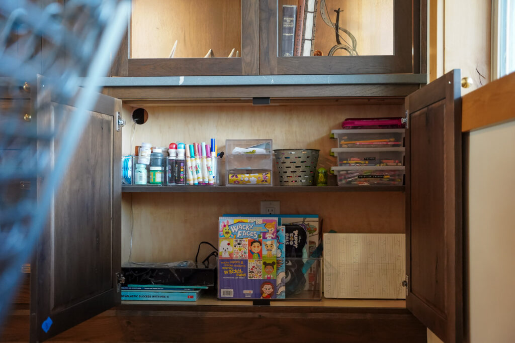
The dining room is honestly so much more than just your traditional Thanksgiving Dinner location. Our family utilizes this space for Birthday Parties as well as a quiet space to work on a puzzle, play board games and the kids have all of their craft supplies stored in here.
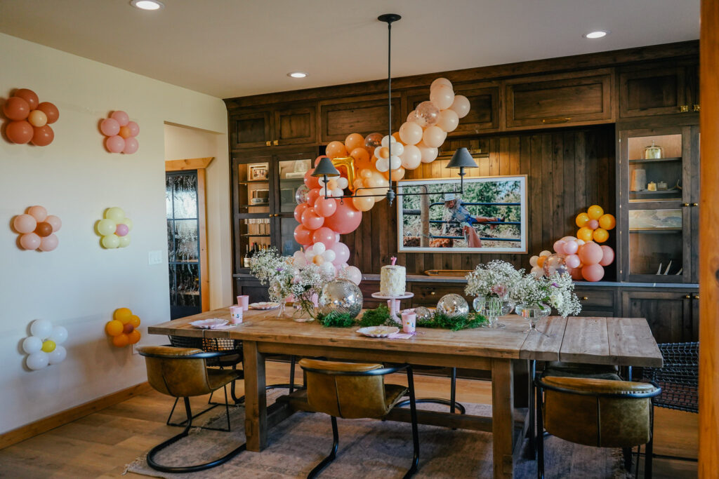
Keep scrolling for Landyn + Sawyer’s Birthday parties (one before the remodel and one after) in this space.
Landyn’s 7th Birthday
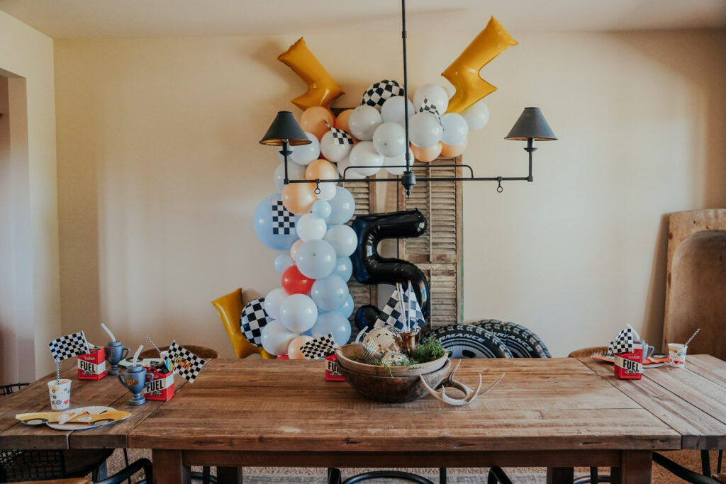
Sawyer’s 5th Birthday (before the Dining Room was fully installed)
The goal for this room was to allow it to become a versatile space that spans beyond just a room for a fancy meal.
We don’t have a “play room” in our home, so it needed to be a place where our kids could take part in their crafts or homework.
We have the option to play music off of the TV, so they can sit in there and listen while they have their quiet time.
Similar Dough Bowls | Pottery Barn | Ballard Designs

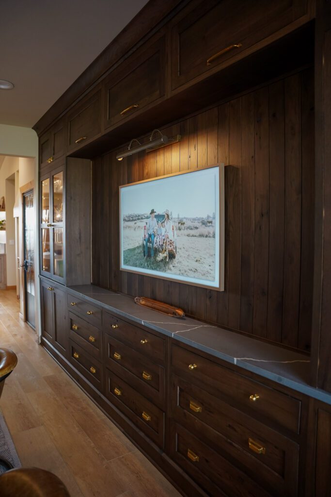
Frame TV | Picture Light | Bin Pulls | Knobs
When we were designing this space, I was explaining to the contractor our concept of wall to ceiling cabinets that I was hoping to achieve in this room. As you can see from the before photo above, it was a completely blank wall.
Aesthetically it needed something grand in this space because any piece of furniture was bound to get lost in this room without an anchor.
The wall is long but awkwardly narrow which make these cabinets a little more shallow than your average kitchen style cabinetry. Although we do get good use of both aesthetics and some storage solutions, it isn’t the best option for larger items due to the very slim design that was needed to achieve the overall fit. The walkway in-between the kitchen and dining room could not be moved in any way due to the kitchen layout on the other side. So we worked with what we had!
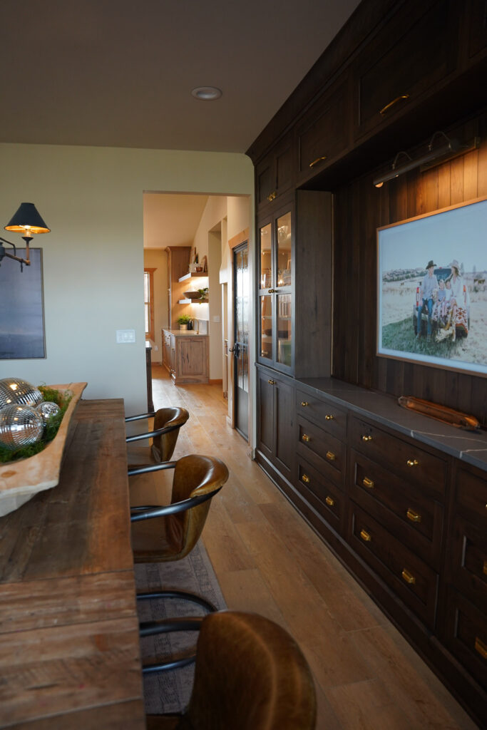


I’m absolutely obsessed with the lighting in this room. With the dark colored cabinetry, it feels like a moody steakhouse at night. All the lights have dimmers on them (including the lights in the cabinets). So you can really capture a feeling of a date night at home here.
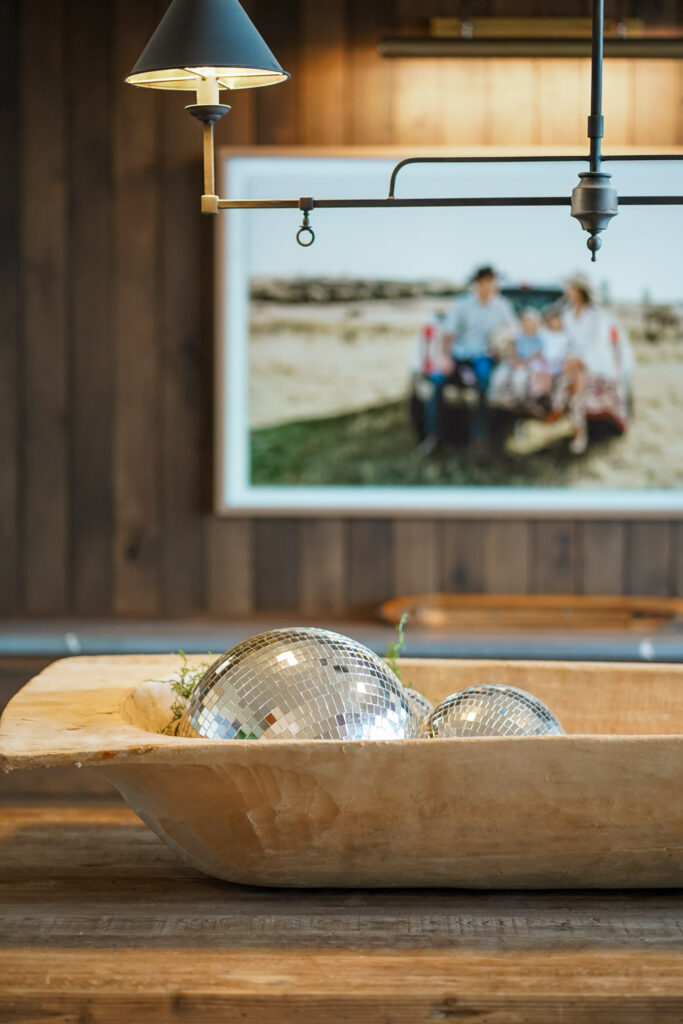
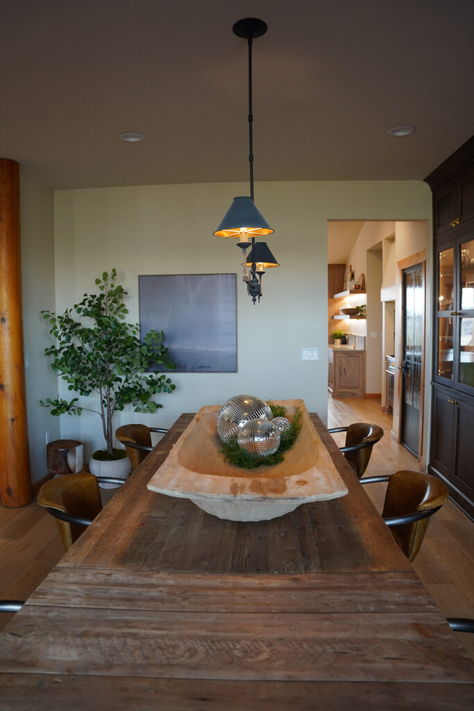
By adding these cabinets, it was such a simple fix to a large room that would otherwise be a sea of white.
I would love to add some wall paneling and paint to this room overtime. But for today, it serves us well as is and was the perfect upgrade to this room.
DETAILS:
Furniture:
Dining Table – RH
Metal End Chairs – Crate and Barrel
Leather Chairs – Wayfair
TV:
Frame TV – Samsung 55″
Frame – Modern Teak Bezel
Lighting:
Chandelier – Lumens
Brass Picture Light – Shoppe Amber Interiors
Decor:
Faux Tree – 72″ artificial ficus tree
Wall Art – Moody Landscape
Disco Balls – 5″ | 8″ | 12″
Accent Stool – Wayfair
Dough Bowl (vintage find) – Similar | Pottery Barn | Ballard Designs
Cabinet Hardware:
Bin Pull – Rejuvenation (Unlacquered Brass)
Knobs – Rejuvenation (Unlacquered Brass)
Latch – Rejuvenation (Unlacquered Brass) | (Large / Small Options)
Cabinet Details:
Cabinets | Crystal Cabinets
Details: Crystal Keyline Inset in Knotty Alder
Cabinet Color: Kodiak / Ultra Flat sheen (matches Kitchen island)
Countertops:
Quartz | Mario and Son (local company) – Sorano Honed Pental Quartz




Comments +